I just so happened to receive two 40% off email promotions on the same day from two different companies. One was a hit and the other was a miss. Let's see if you can figure out which was which:
When I clicked the main image, where it says "SHOP NOW>", this is the landing page:
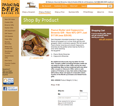
When I clicked the "Shop Now >>" button under the main image, this is the landing page:
Email Promo #1:
Email Promo #2:
For me, the obvious winner is Email Promo #2. In order for an email promotion to be effective, useful, and actionable - it needs to have all the ingredients that make it easy for people to see:
Email Promo #1:
Here's what the email piece looked like in my inbox:When I clicked the main image, where it says "SHOP NOW>", this is the landing page:
Email Promo #2
Here's what the email piece looked like in my inbox:When I clicked the "Shop Now >>" button under the main image, this is the landing page:
Which was a hit and which was a miss for you?
Email Promo #1:
- Email Headline Offer: "Ends Soon. Shop our sale, in stores & online."
- Incentive to act now: "Extra 40% off Final Sale"
- Fine print: offer valid on purchase of final sale items in stores or online from 1/21/13 - 1/29/13 (4 day purchasing window from date email sent)
- Visual of items included in promo: N/A
- Click-through landing page: Same as email promo
- Promo redemption: Enter code at checkout
- Steps to redeeming promo: 4 clicks led to an item which was listed as "sold out". Tried again with different item, 5 clicks to checkout.
Email Promo #2:
- Email Headline Offer: "40% Special Brownies for Your Valentine"
- Incentive to act now: "Weekend Special Offer for Valentine's Day"
- Fine print: offer only valid through 1/27/13 (2 day purchasing window from date email sent)
- Visual of items included in promo: Three items featured with clearly marked discounted pricing and shop now buttons
- Click-through landing page: Purchase page for individual item
- Promo redemption: Prices already adjusted on website to reflect promo
- Steps to redeeming promo: 3 clicks to checkout
For me, the obvious winner is Email Promo #2. In order for an email promotion to be effective, useful, and actionable - it needs to have all the ingredients that make it easy for people to see:
- WHY they would want something (for Valentine's day and to take advantage of a special deal)
- WHO they are buying it for (brownie lovers)
- WHEN they need to decide (before tomorrow ends)
- WHAT they should buy (these specific brownies that are on sale and available right now)
- HOW to close the deal as quickly and easily as possible (with easy to find action buttons and short clicking process to check out)
Anne Ruthmann is a lifestyle & wedding photographer from Boston, MA. She spent 10 years practicing marketing & management in corporate and non-profit businesses before pursuing her passion for photography in 2004 as an independent small business. She loves helping others find creative and smart solutions to business problems. Follow her on Twitter to see her daily adventures and thoughts.


In my perspective, the email #2 is a winner as well! A consumer can immediately pinpoint his/her preferences from these presentations alone. The layout is a very crucial aspect in promotion. The second option obviously knows that. Like you’ve said, it is effective, useful and actionable. :]
ReplyDelete